A Fantastically Visual Approach for Supporting Complex Decisions
October 11, 2018
When it comes to retirement investing, do you know your volatility tolerance? Most people don’t.
However, if Guidance, a retirement investment application, knew your volatility tolerance, along with a handful of other important, yet equally obscure investment preferences, it could pick an ideal financial plan for you. That’s the challenge that Guidance’s designers faced. How do they learn this key information about their users’ preferences?
They could describe volatility the way seasoned investors think about it: as an increasing frequency and amplitude of variation in the worth of an investment instrument. But that definition won’t work for most of Guidance’s users, many of whom are not seasoned investors but hard-working employees who just want to save for their retirement.
Guidance’s designers could describe volatility visually, as a series of peaks and valleys in how much their retirement money is worth. Low volatility is a smooth, steady increase in value. High volatility shows larger increases, but also sudden decreases. The peaks and valleys happen more frequently and the differences get larger as volatility increases. Again, that’s a lot of words to help Guidance’s users get a picture in their head.
Guidance’s designers arrived at a great solution. They provided a series of pictures of the employee’s retirement savings over time. The lowest volatility was a nice smooth increase over the years left before retirement. The highest volatility showed a larger increase rate, but there were many huge peaks and valleys in between. The designers provided 5 such pictures, in increasing amounts of volatility.
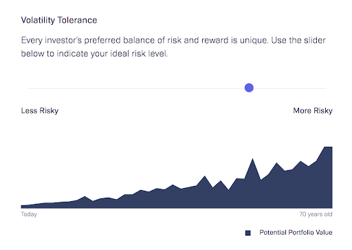
Guidance’s chart showing medium-high volatility risk.
Users could switch between pictures with a single slider. The picture they chose would indicate to Guidance that user’s volatility tolerance. An elegant solution to visually explain a complex concept.
The Guidance team used the users’ data to tell a series of stories. Stories about what that investor’s financial life could be like upon their retirement. The Guidance user could choose which story they were most comfortable with, and Guidance would set to work to make that story happen.
Data visualization is an essential storytelling tool. Designers, equipped with solid data visualization skills, can take complex concepts and make them real for the users. That’s what helps designers deliver the best products and services, especially when it comes to complex decision making.
Which complex decisions do your users face? Can you up your data visualization game to make you a better designer? At UI23, you’ll want to spend an entire day in Brian Suda’s full-day workshop, Successful Storytelling Through Data Visualization. There are still seats left. Register Today